Vet Connect Plus
Role: Lead UX Designer/Visual Designer
January, 2015
At the beginning of 2015 I joined the VetConnect Plus Mobile Team working on IDEXX’s diagnostic results products. There were design patterns already established and new features were to be introduced in the 2nd quarter. The challenge was working through an existing framework, keeping the integrity of the app while adding simple interactions to solve complex problems.
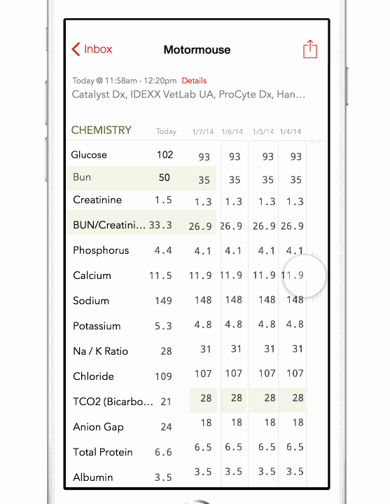
VetConnect mobile allows doctors to review patients lab results as soon as the lab has finished tests. One task I worked on solving was applying visual affordances to tests that have been run before. Below, you can see the integrated flow with explanations of these interactions and their cause and effect.
App Flow Diagram
This was a flow diagram with feature call-outs that complimented the clickable prototype. This served as the script while the prototype was the primary model for discussing the UX and UI.
Prototype
During presentations with my development team I would demonstrate what I believed to be the best solution and share the alternative designs if suggestions they gave matched previous explorations. An example of this can be seen at the beginning of the video below where 'New Features are Available' modals are displaying in various forms.
Historical Results - Developing a New Interaction
One issue in talking with our customers was that they wanted to be able to use as much of the patients past history to see if the recent result was something new or an ongoing issue. We tried many different solutions where they would tape and scroll horizontally but the discoverability was an issue as well as the interaction.
One day while playing a card game I had a eureka moment. I was thumbing through my hand, looking for specific card types when I made the connection with the Historical Results problem the previous day. I jumped onto my computer and built a rough prototype of what that interaction on the phone would feel like. Had a few issues with the math so fellow interaction designer and friend Josh Tucker (@joshmtucker) helped out with the accordion.

Once I realized that this could be a real viable solution I implemented it into the design for context. The right side of the screen shows the results stacked, continuing the card metaphor it physically looks like cards are stacked up giving it that affordance one would see when holding cards in their hand. A simple swipe with your thumb reveals the cards. We were happy with the results, it was a question of whether it would be evident with our customers.
We were quite happy with the results and 8/10 of our customers understood the interaction right away. We noticed they would tap the stacked card affordance to see what would happen-, so we added "bump" or slight reveal and have the cards move back in place, this encouraged them to drag the cards which served to work quite well.
Red Lines
Although the interactive prototype was incredibly helpful in communicating the concept as well as giving development a start in sizing the effort in programming the functionality, when it came to details, I created a one sheet to answer all the remaining questions they wanted answered for the following sprint.
It was really important for our remote development team to get the little details right and red-lines are usually a tedious task for designers. I reused all my assets created for the flow as well as the prototype and it took only an hour, which is minimal to the amount of email/calls and feedback. The dev team to a single pass and we reviewed and tightened things up shortly after
With the an expanded view of a trending result, we wanted a layout that could be fluid across multiple devices while being accommodating to varying results of an analyte; and in order for the design to be successful we had focus on why our customers were selecting an analyte and what answers do they need to get their job done. By establishing a common pattern across varying analytes we are able allow our customers anticipate what would happen certain section of the trending result and anticipate what when selected.
New Features Walk-through
I strive to make a design that is obvious to avoid feature walk throughs but was the large update it was quite inevitable as we were introducing new and complex interactions it was important our customers understand how these features could benefit their day-to-day work process.
I mapped out a flow to get a sense of timing. The objective was to make it interactive, mimicking the same gestures as the features we were introducing by guiding our customers and making if fast so they could jump right into the app.
One of our Project Managers was attending a conference where Vet Techs and Doctors would be, we felt it would be an a great opportunity to put this features in the hands of our customers and get instant feedback. I put together the interactive prototype and sent it to our PM to download. She did a half dozen ad-hoc testing session and after the third one a small flaw in the design was discovered. I updated the prototype quickly and just re-uploaded the changes. Our Project Manager was able to get more feedback with the new iteration.